Wordmark
Our wordmark is the primary identifier for the Qarry brand. We highlight Qarry’s cheerful and approachable essence through the suggestion of a winking emoticon in the wordmark. It radiates a brand with personality and a trustworthy character.
Discover the essential principles of wordmark usage, etched in stone (not really), as we acknowledge the fluidity of our brand. Let this page be your trusted companion, guiding you with unwavering clarity.
Grant our brandmark the breathing room it deserves. When accompanied by other elements, maintain a minimum clear space to preserve brand consistency. Let our brandmark shine with unwavering presence and impact by reserving enough clear space before introducing additional design elements. Remember, this distance is determined by the height of our Qarry ‘q’ and this amount is the minimum, more is better.

The wordmark of Qarry possesses a unique set of considerations. While it may not have a laundry list of rules, placing it can be a tad tricky due to its rounded character and that cheeky smiley curve at the bottom. This playful asymmetry causes a subtle visual imbalance, with the center positioned slightly higher than the metric center. Now, for the alignment and placement, pay heed to just two exceptions: steer clear of the bottom right and avoid centering it on the left or right. These chaotic configurations disrupt the harmonious balance and diminish the wordmark’s mighty presence.

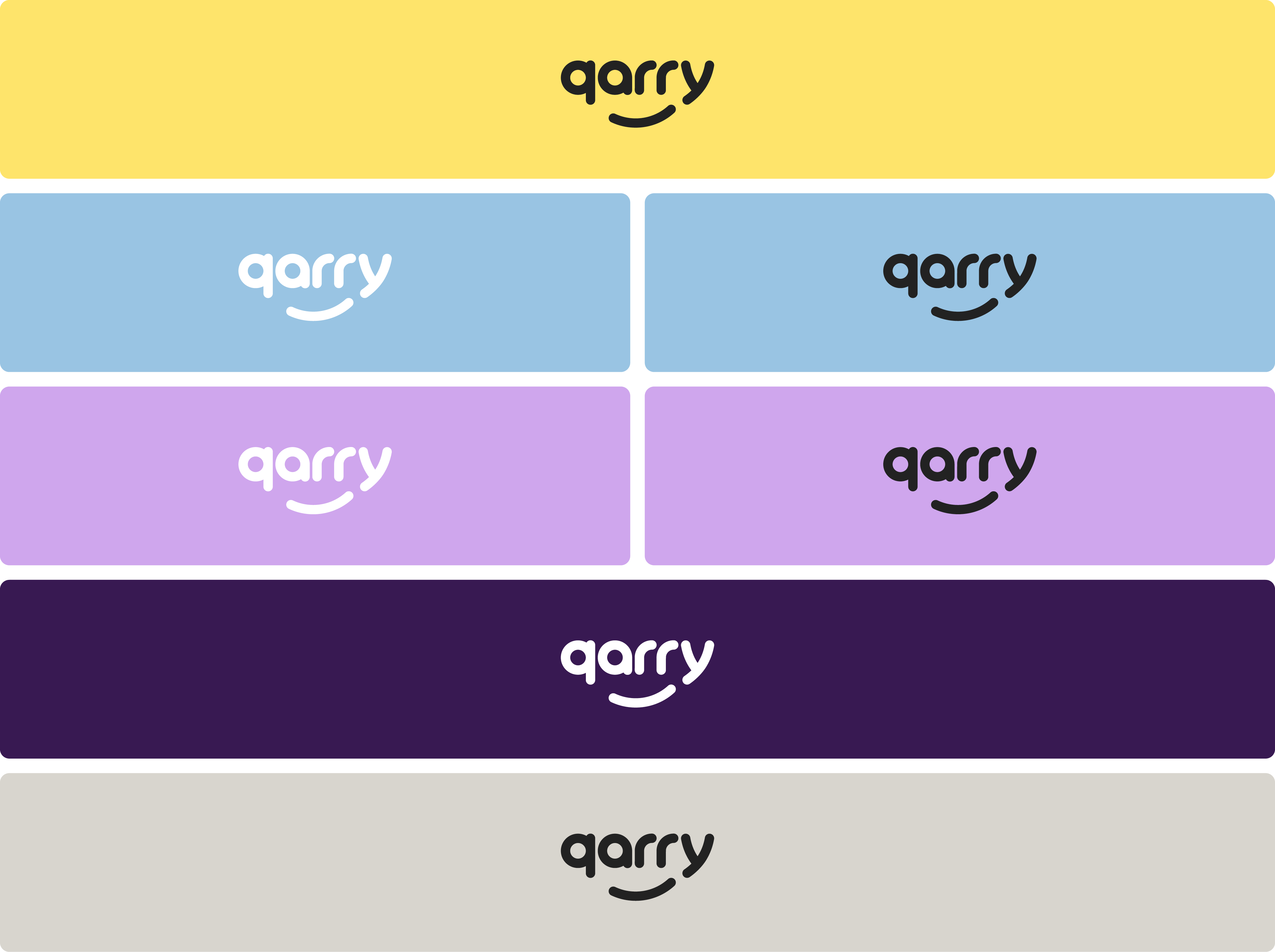
When using the brandmark on coloured backgrounds, always make sure there is enough contrast between the background colour and the brandmark. This is for the highest level of readability whilst still being cheerful. In most cases, use the logo in black to be safe. Only on dark colours, use the logo in white for better contrast. Other colour uses of the wordmark are not allowed. The following examples are approved combinations.
Our wordmark is the superstar, the face of our company, making that all-important first impression. We love to flaunt it, centered, smack dab on top, especially on bright and airy photography where it shines in white. But hey, if the background doesn’t provide enough contrast, let’s get creative! Consider switching up the wordmark to black or explore alternative placements that give our logo the spotlight it deserves. The goal? Maximum visibility and impact. Let’s ensure our wordmark steals the show, no matter what.

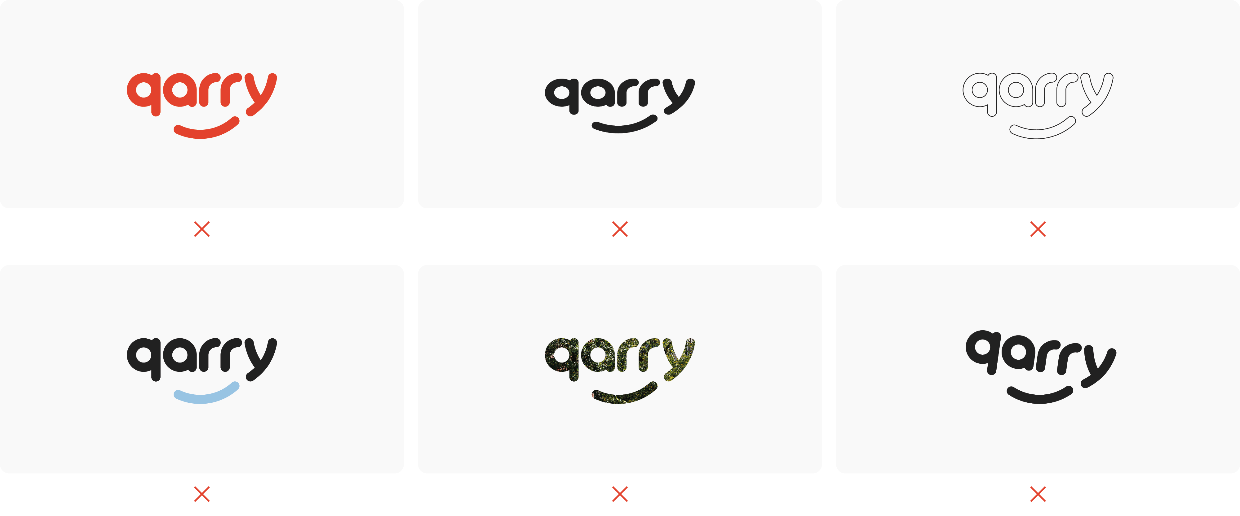
Avoid the temptation to venture into forbidden territory by altering colours outside our brand palette, distorting the wordmark’s sacred form, tampering with the typeface, adding unnecessary outlines, filling it with images, indulging in reckless rotations, employing more than two colors, or disrupting its balanced proportions. Stay steadfast, and honor the integrity of our wordmark.