Typography
In our perspective, the typeface holds almost as much importance as the logo, as does the correct way of utilizing that typeface. With our font, we communicate, establish connections, inform, and educate. Therefore, there are specific rules put in place to ensure uniformity in our approach.
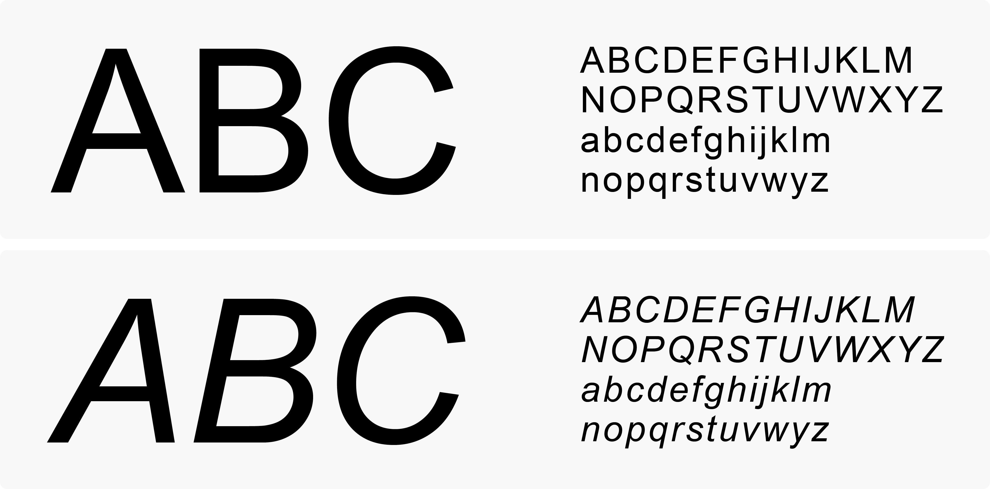
In the Qarry visual identity, we employ a sole typeface known as Relative, crafted by the esteemed Colophon typefoundry based in London. We have selected this font for its pristine and distinct qualities, characterized by semi-rounded corners and an inviting demeanor. Its friendly aesthetics harmonize seamlessly with our brandmark and colour scheme.
Please note that a license is required for the use of the Relative font.
Relative – www.colophon-foundry.org/typefaces/relative/
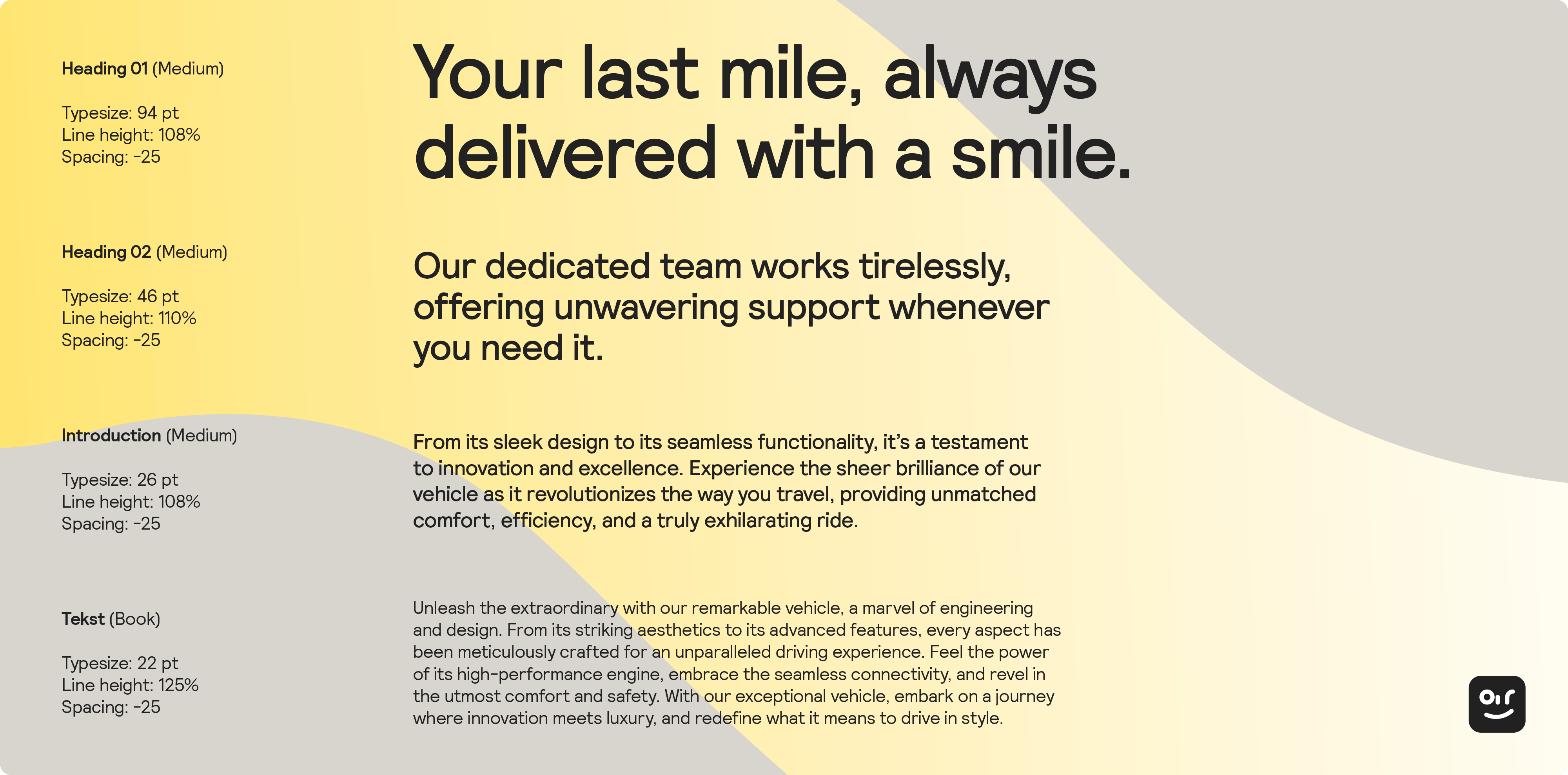
This process is refreshingly uncomplicated as we utilize only four variants: Book Regular, Book Italic, Medium Regular, and Medium Italic. Essentially, this boils down to two main styles, each offering the option to emphasize text through italic formatting. As a general guideline, the Book style is suitable for paragraphs, while the Medium style is ideal for titles, streamers, and headlines.

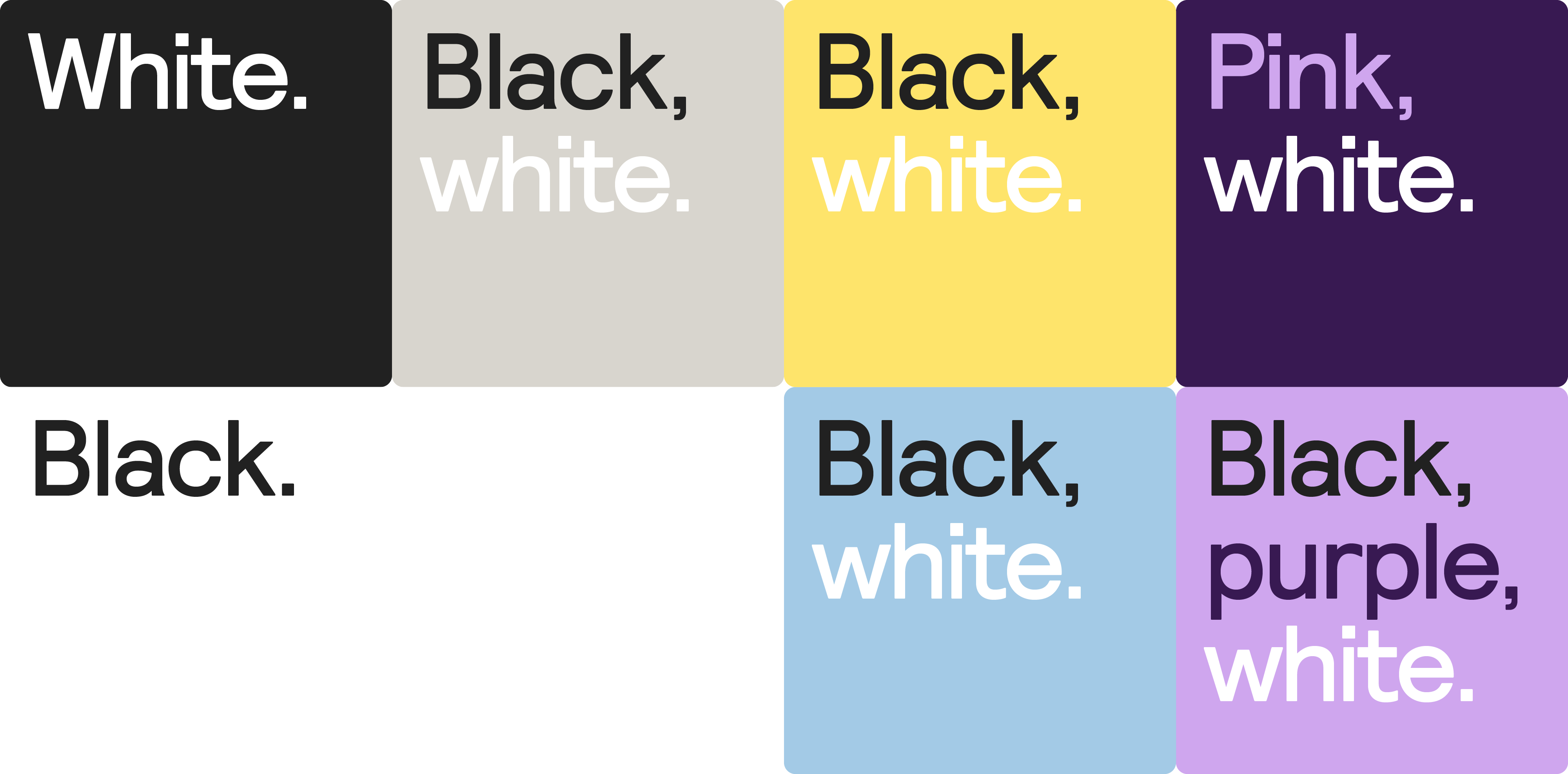
When it comes to using colour in typography, we maintain some flexibility. Instead of plain black, we employ our branded ‘Soft Black’ (#222222) for a distinct touch. Apart from that, you are encouraged to explore and experiment with colours, as long as you adhere to the approved combinations showcased on the ‘Colour’-page. Remember, as text is our primary means of communication, prioritizing readability is essential.
In the event that the Relative font is unavailable, please utilize Arial Regular as an alternative. This applies to materials such as offers, emails, and similar content. For documents created within Microsoft Office or Powerpoint applications, it is imperative to use the Arial font. In doing so, we ensure that our communication remains streamlined and focused.