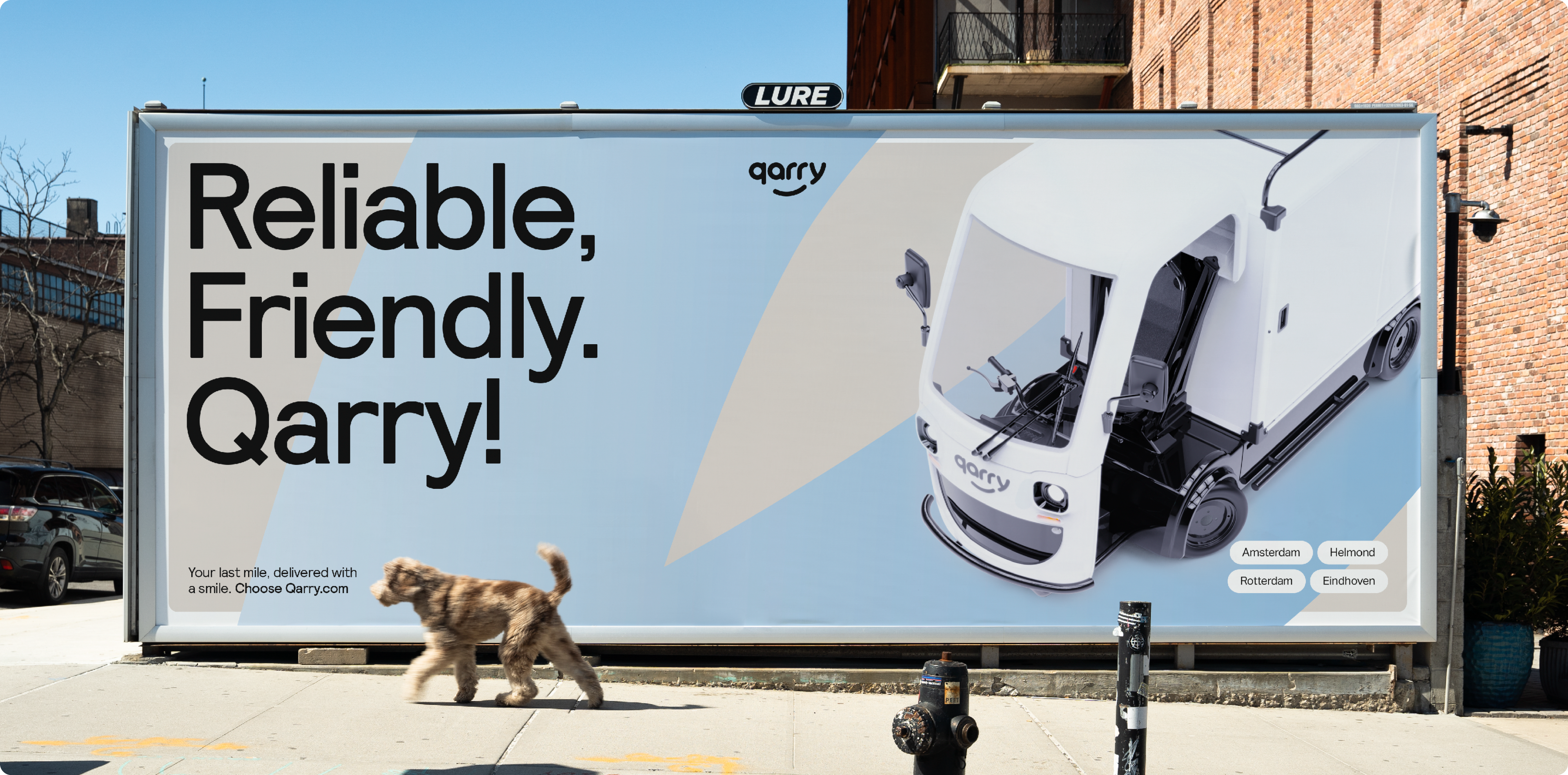
Swoosh
The Qarry brand identity incorporates a distinctive element known as “the swoosh,” a graphical feature designed to evoke a sense of motion in both static and dynamic assets. This fluid line represents the smoothness and agility of the vehicle’s movement, characterized by its soft yet substantial form, exuding playfulness and energy. Inspired by the smile in our logo, the swoosh captures the dynamic essence of our brand.
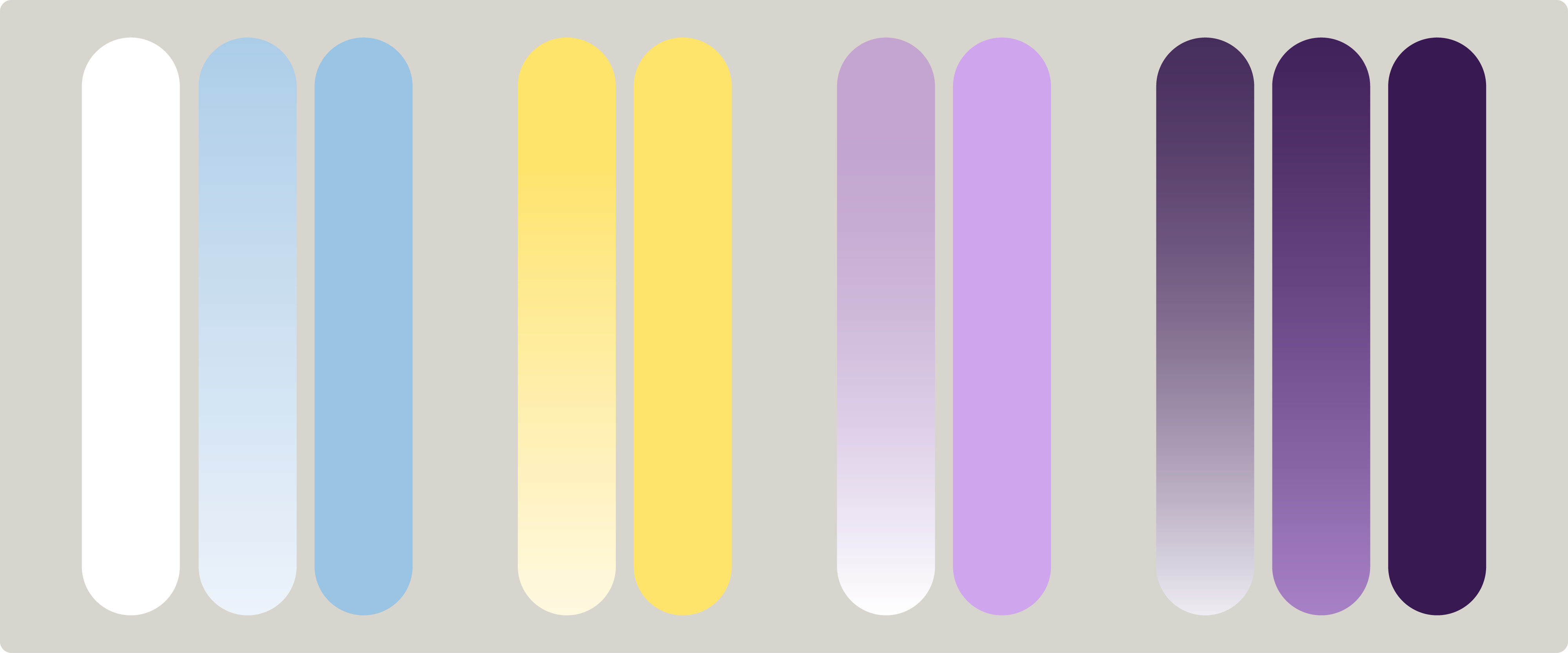
In the colouring of “the swoosh,” there are, of course, some rules set to avoid creating a chaotic circus of colours. Below, you’ll find all the approved visual examples, from the crisp airy white (which can be used on any background colour) to the gentle tones of light blue to white, and even venturing into playful purple to and pink. Using the multiply effect in design is allowed for use of yellow on yellow or blue on blue for instance.
No strict guidelines dictate the thickness of the swooshes, as it varies based on the specific asset. Nonetheless, the line should exhibit a substantial weight, with a general recommendation of maintaining a minimal thickness equal to at least one-fourth of the canvas height.
When it comes to placement, embrace your creativity and explore different positions on the canvas. However, ensure that the beginning and ending of the line never appear simultaneously on the screen, avoiding the display of the complete line. Feel free to experiment with overlaps and extending beyond the canvas boundaries, adding a touch of dynamic flair.

When it comes to gradients, you have complete freedom to choose whether to incorporate them or not. Gradients offer the advantage of introducing a sense of movement, even in static assets like posters, billboards, or folders, aligning with the essence of the swoosh. However, it’s not always essential; a solid-coloured version can suffice and sometimes even be more effective, particularly in digital use when the lines are in motion.