Brandmark
Prepare to meet the charismatic companion of our brand—our brandmark! As the secondary identifier for Qarry, it captures the very essence of our helpful and cheerful nature, radiating a personality that embodies trustworthiness. With its captivating smile, our brandmark stands as a beacon of recognition and lightheartedness. There are rules and guidelines to honor its proper use.
Simply put, this is the source of our cheerful smile! (-;
Revealing the role and application of our brandmark—a versatile counterpart to the wordmark. The brandmark functions as a secondary logo, employed in conjunction with the wordmark or when legibility is restricted (e.g., on small surfaces like pens). While always subordinate to the wordmark, it imparts character, colour, and cheerfulness to assets, fostering balance and generating buzz.

Similar to the wordmark, the brandmark also requires careful consideration of its placement within certain margins. The rule is to ensure that at least 3/4th of the width/height of the brandmark remains intact in its designated position. Please refer to the example below for clarification.

To enhance balance and elevate its significance, we encase our brandmark within a rounded box—a visual centerpiece that commands attention. The wink can stand freely without the bounding box on imagery alone, but in other contexts, we employ the box to ensure the brandmark remains prominent and unmistakable. This intentional design choice safeguards against any risk of the brandmark being overshadowed or diluted in impact.

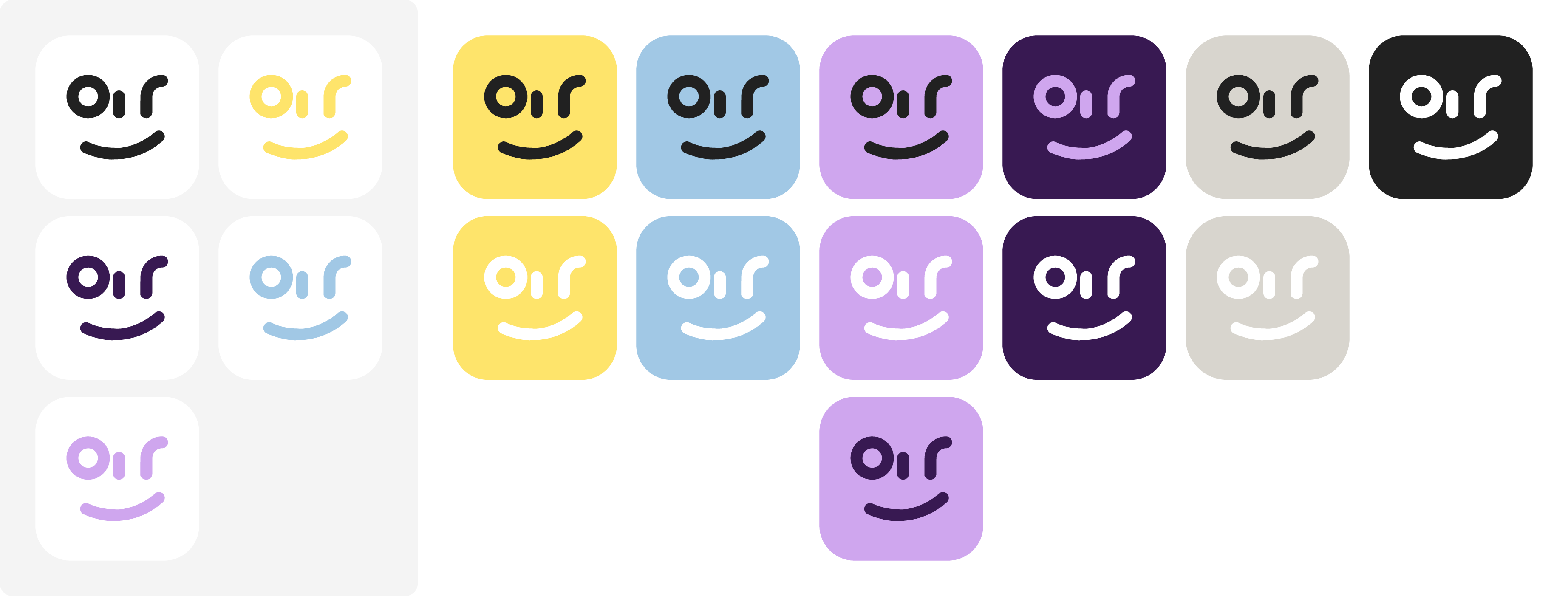
Within the realm of our brandmark, we unveil a spectrum of approved colour combinations and variations. These carefully curated options have been selected to ensure optimal contrast and visual harmony. It is essential to adhere to these designated choices, as alternative variations may lack the necessary contrast required to maintain the integrity of our brand. For the correct use of brandmark on colour, see Combinations on the Colours page.
The placement of our brandmark follows a set of vital rules, designed to amplify its impact and ensure the strength of our brand. Strategic alignment allows sufficient space for our brandmark to convey its power effectively. It finds its ideal position in the top corners (although the wordmark may be a more suitable choice here), as well as the bottom corners and bottom center. However, the top center is reserved exclusively for our wordmark, as it holds a special significance.

Avoid the temptation to venture into forbidden territory by altering colours outside our example selection, distorting the brandmark’s sacred form, tampering with the wink, adding outlines, filling it with images, indulging in reckless rotations, employing more than two colours, or disrupting its balanced proportions. Stay steadfast, and honor the integrity of our brandmark.